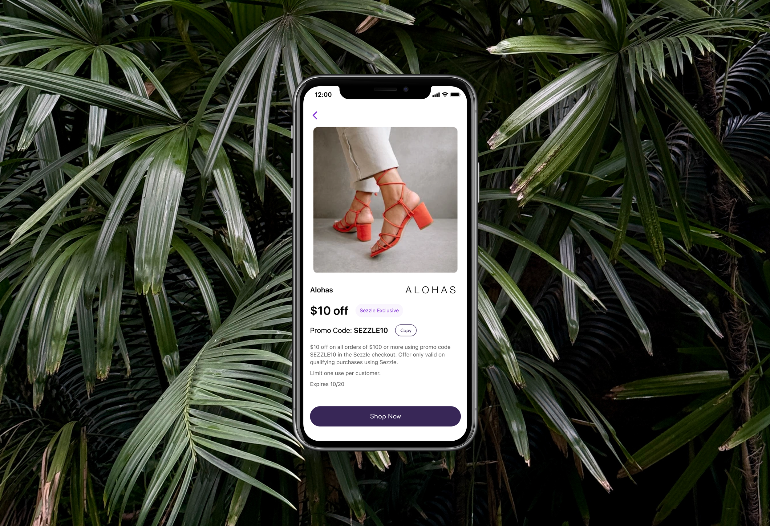
Introduction
A unified shopping experience for customers to browse stores, access coupons, and check out seamlessly.
Background
Sezzle is a financial technology in the buy now, pay later space with a mission to financially empower the next generation. The most popular offering enables customers to split their purchase into 4 installments over 6 weeks.
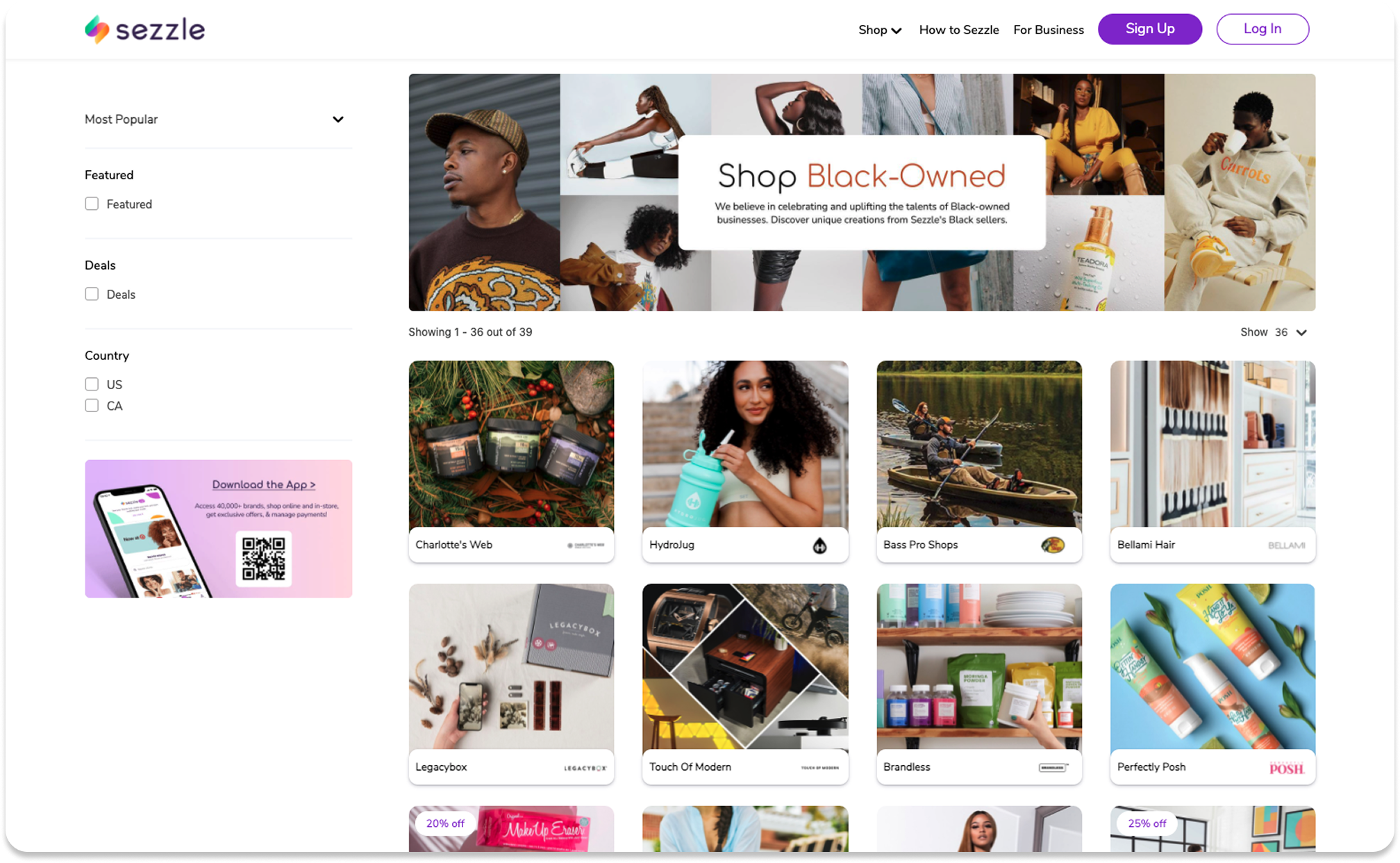
Sezzle offers a marketplace for customers to browse all the businesses that accept Sezzle in one place.
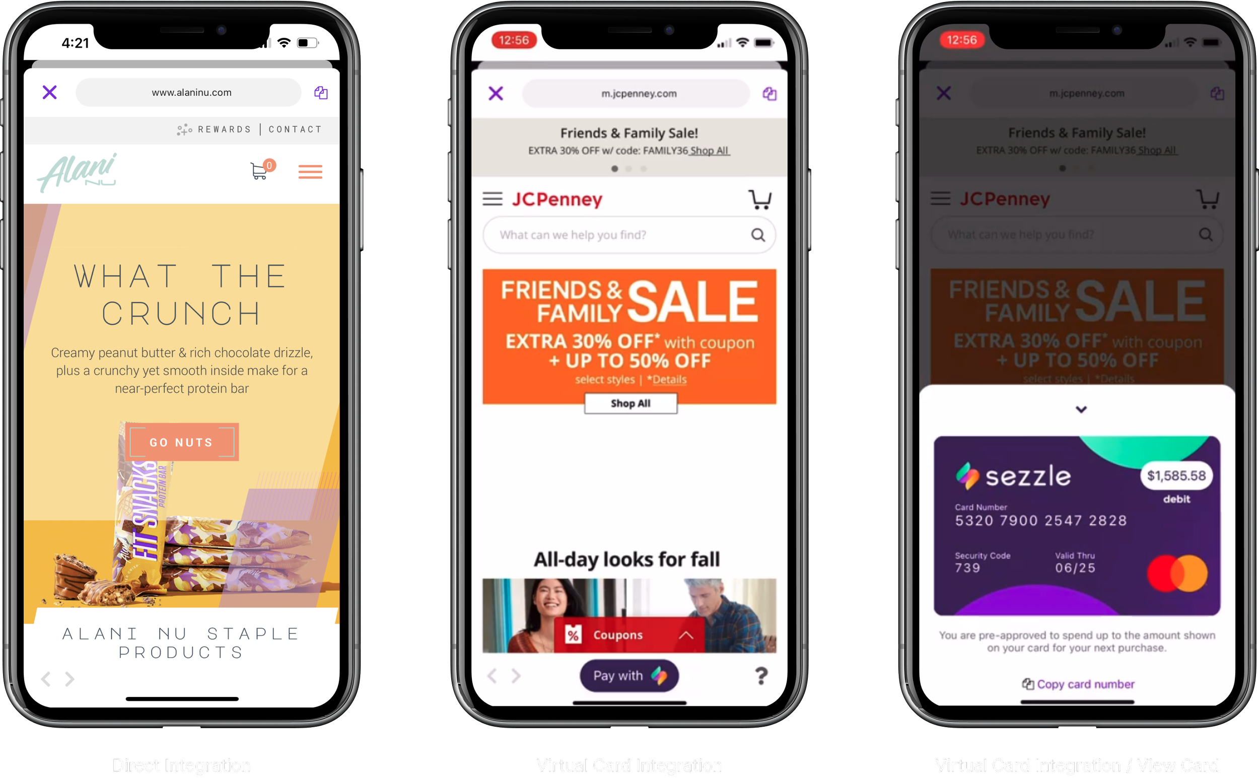
At the time, merchants could integrate with Sezzle in two primary ways: a direct integration or a virtual card. The checkout experience varied depending on the integration method.
The difference:
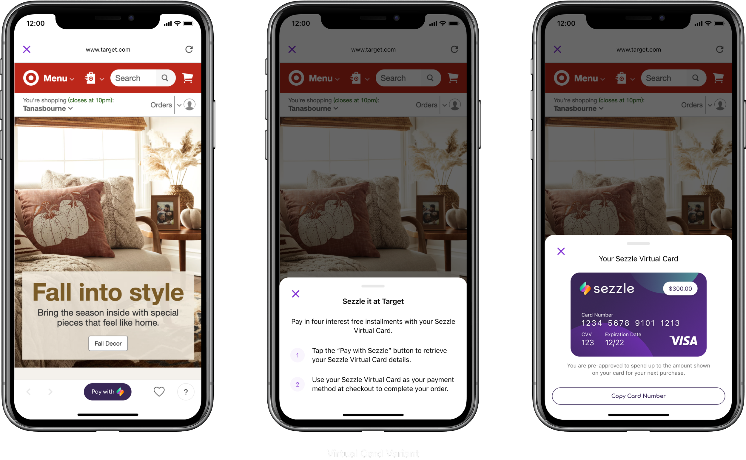
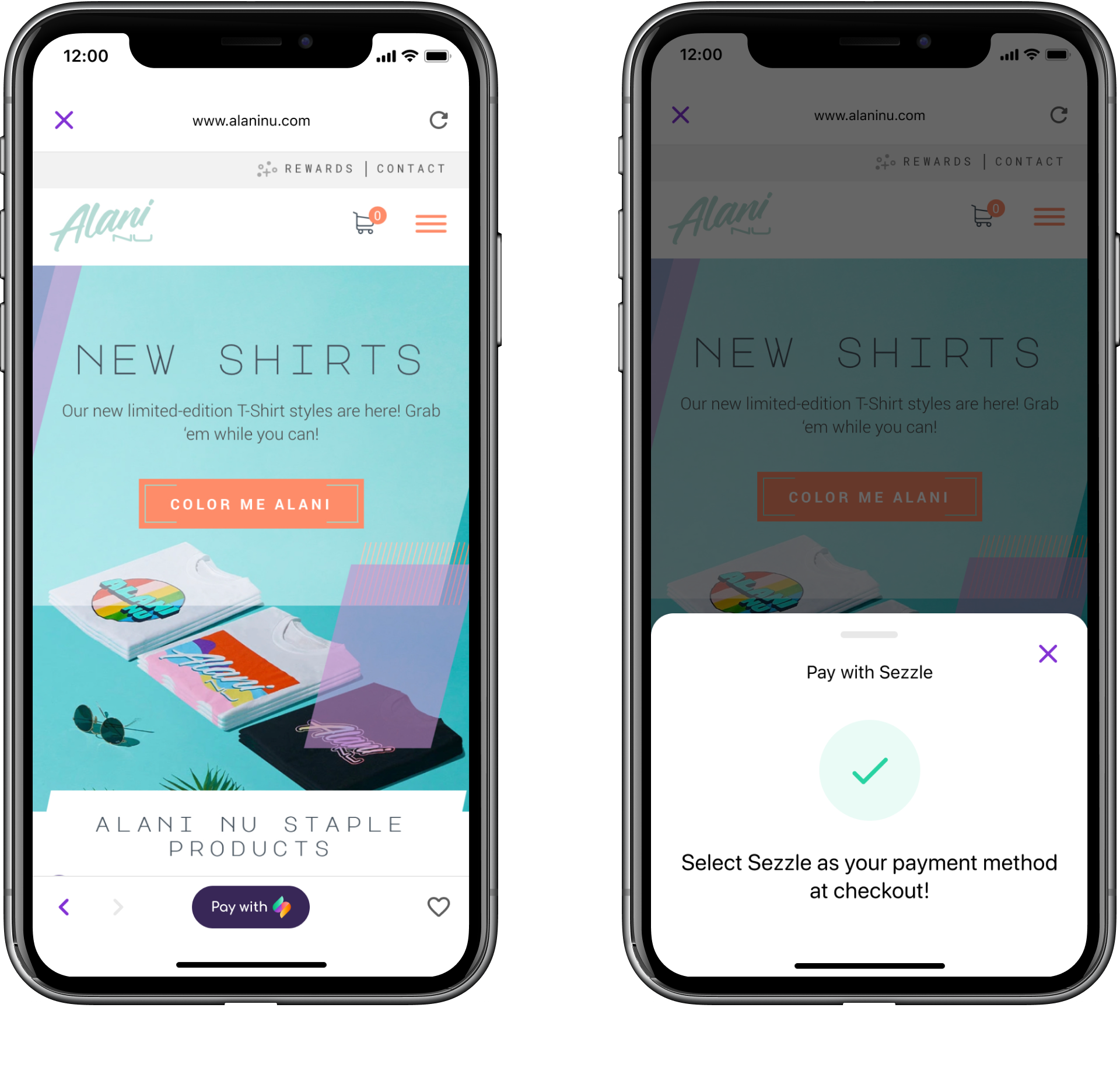
Direct integrations entailed redirecting customers in checkout to Sezzle
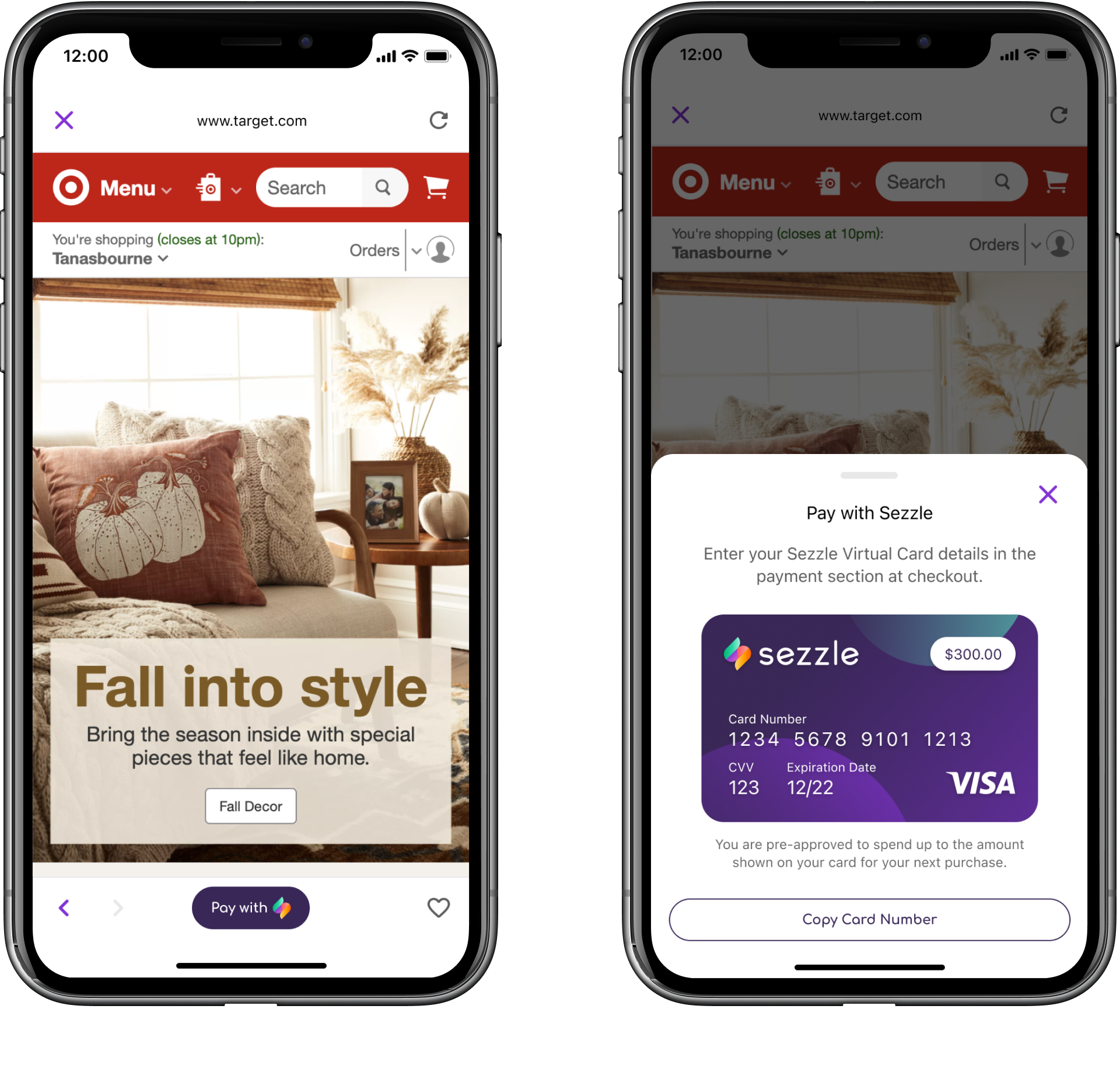
For virtual cards, customers entered their Sezzle Virtual Card information, just like they would a normal credit card
Directive
Design a cohesive shopping experience in-app for customers to browse Sezzle merchants, find discounts, and place orders –– regardless of integration type.
Analysis
The existing design was inconsistent between directly integrated merchants and Virtual Card merchants. Furthermore, there was no obvious benefit to shopping in Sezzle’s app over using a standard web browser.
Initial Designs
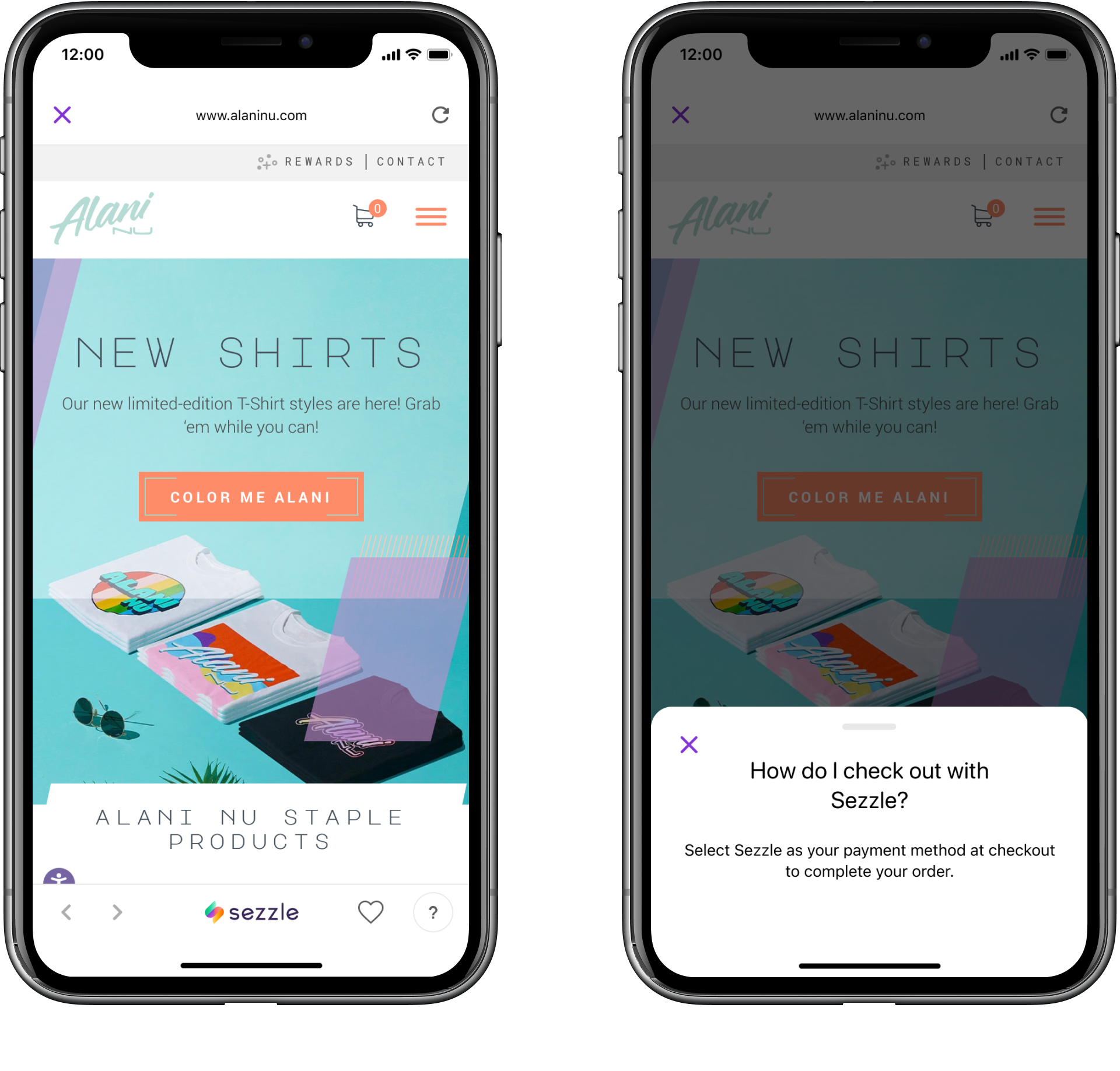
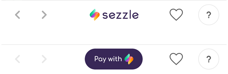
For the first design, I tried making the toolbars consistent across integrations. The Virtual Card toolbar remained largely the same, while I introduced new elements to the Direct Integration toolbar in the name of consistency.
Research & Testing
Through user testing, I learned that the toolbar was overwhelming for customers. Elements I had added, like the Sezzle logo and the help button, were adding visual noise and not enough function to justify the tradeoff.
Final Designs
To establish a consistent mental model for Sezzle’s shoppers, I displayed the “Pay with Sezzle” button regardless of integration type. This improved discoverability significantly, since shoppers could tap this button to pay, or learn how to pay, with Sezzle at any given merchant.
This created a consistent view across merchants and minimized frivolous functions in the toolbar. Simplifying the toolbar’s design made the next stage of this project much easier!
Part II
With the toolbars now consistent in design, I was tasked with introducing coupons to Sezzle’s in-app shopping experience.
Background
Sezzle’s mission is to financially empower the next generation. To reflect that mission, Sezzle should help customers save money in any way possible, whether that’s helping customers budget with installments or by saving money at checkout with coupons.
Sezzle had no way to display promotions or deals from its merchants. If a customer was looking for a sale or coupon code, there wasn’t a way to discover that in Sezzle’s app. The customer would have to visit each store’s website, which can be time consuming (and fruitless).
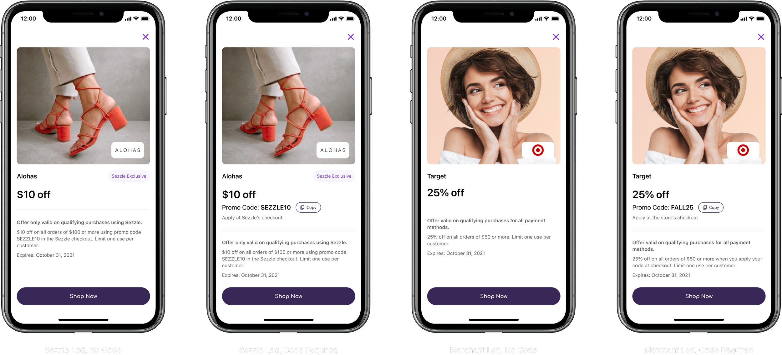
Furthermore, Sezzle ran its own promotions that let customers apply a coupon code in Sezzle’s checkout (across all merchants) for even more savings.
Directive
Design a way for customers to discover and apply coupons, all within the Sezzle ecosystem. Not only will this feature align with Sezzle’s mission statement, it will also drive more traffic to Sezzle’s app and increase sales.
Research
Analyzing similar products was crucial. There are a handful of players in the buy now, pay later space, including Klarna, Afterpay, and Affirm. Other cool apps also cater to similar marketplace experiences, like DoorDash and Uber Eats.
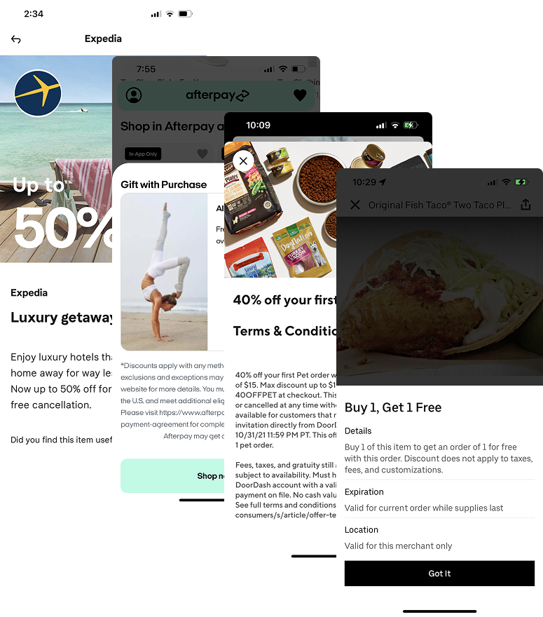
Findings:
Customers should be able to see current sales without having to open a store’s website
Customers should be able to easily find coupon codes and requirements (ie. order minimums) as they shop and check out
Initial Designs
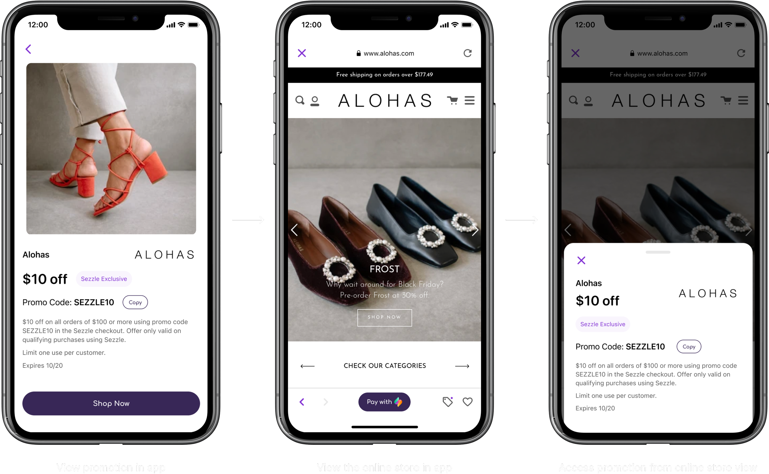
Based on my analysis, I wanted to prioritize two elements the most: what the sale is and what the customer needs in order to access that sale, like a coupon code or minimum spend amount.
I deprioritized all other information to relieve the interface of clutter and noise.
Testing
Test participants exhibited a lot of confusion about when to apply a coupon code. Since Sezzle-run promotions required the coupon code in Sezzle’s checkout, while merchant-run promotions required the coupon code in merchant checkout, things could get confusing quickly.
I also learned what information was most important to our customers:
The promotion itself (ex. $10 of $50)
Promo codes (if applicable)
Expiration date
Final Designs
Following many iterations, design critiques, testing rounds, stakeholder calls, and perhaps too many Slack messages to my PM, we had a design.
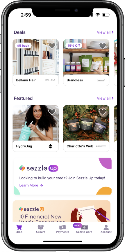
Savings At Your Fingertips
Shoppers can see immediately on Sezzle’s home page if there are any current promotions by looking for the sales badge.
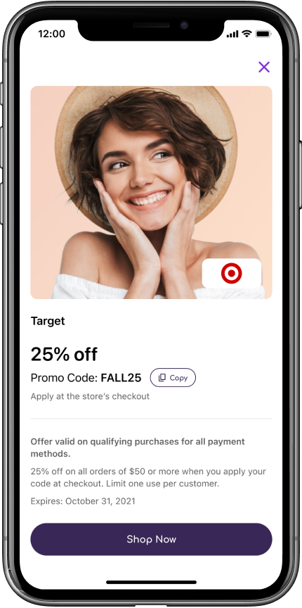
What a Steal!
Tapping that badge reveals everything they need to know about the promotion: what it is, how to use it, and when it expires.
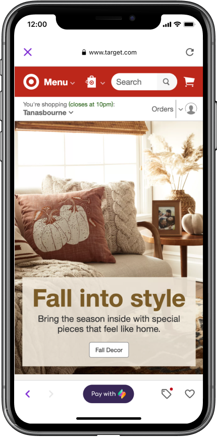
Never Too Far
Once the customer proceeds to the online store, they can always get a reminder of the promotion by tapping the sales tag icon.
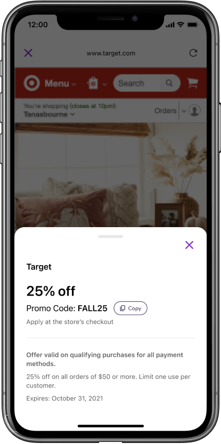
Done Deal
Tapping the sales tag icon displays a slide-up modal with all the same information as before. This lets customers reference the promo anytime, and copy the coupon code at check out without ever having to leave the app.
Four Variants, One Unified Design
Impact & Takeaways
“Deals” Carousel became one of the top 3 carousels
Contributed to a 30% increase in traffic to merchants
Cross-functional collaboration is key!!!