Introduction
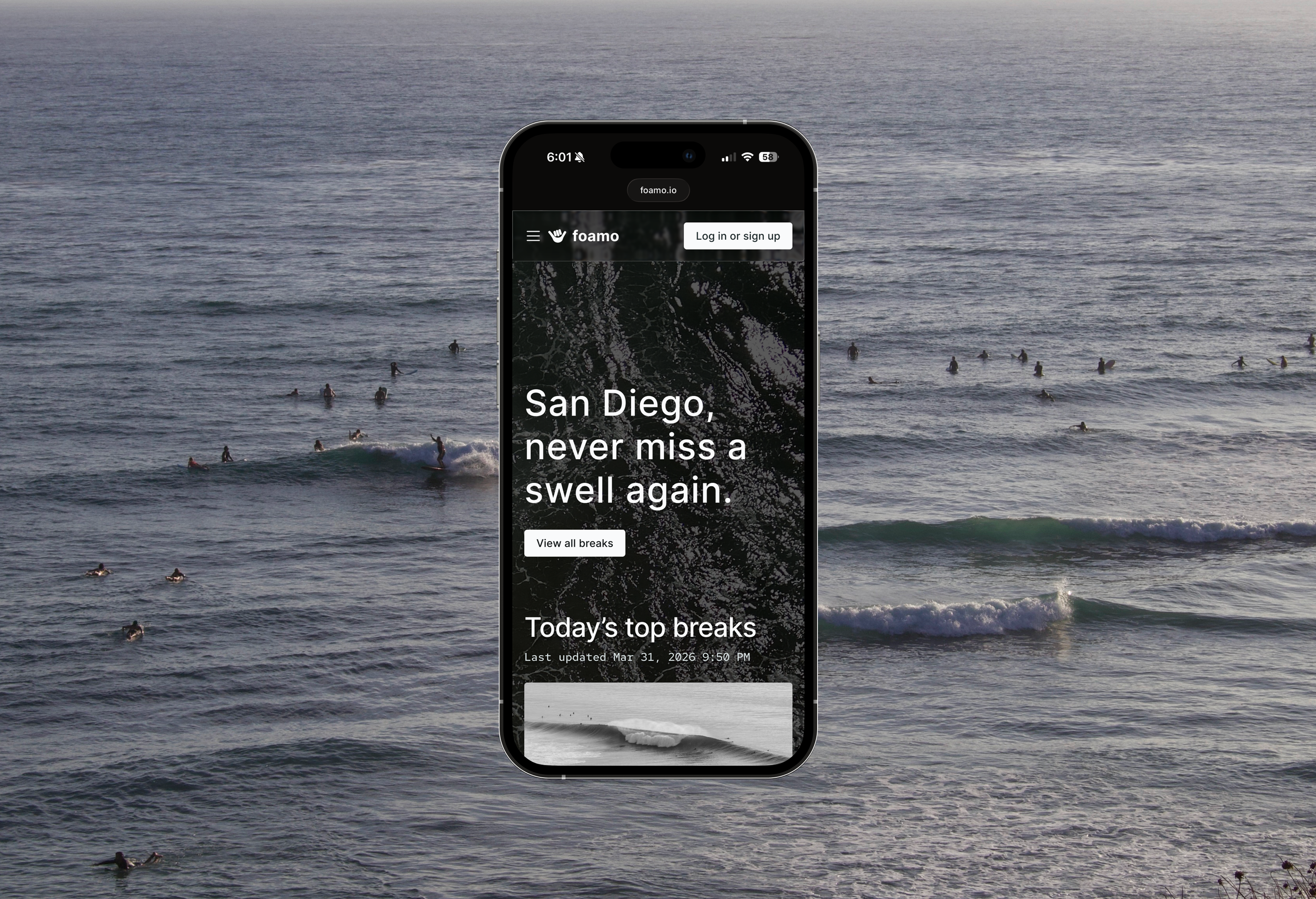
Foamo is a surf forecasting website that prioritizes getting you out on the water. Built for the people, by the people.
-
1 engineer + 1 designer
Foamo’s founder and engineer, Hunter, brought me on as the designer early in the process. Getting to work on Foamo’s product design was a wonderful opportunity.
-
About 3 months
-
Competitive research, user research, user experience design, visual design, and branding
Background
Surf forecasting should be simple.
Check the surf
If the surf is good or fun or both → go.
However, there’s a lot of chatter about the current landscape of surf forecasting. Ratings are misleading, forecasts are wordy, visual designs are dated, and sometimes surf cams aren’t even pointed at the break.
The question was simple: how can we minimize the time we spend looking at breaks on our phones and maximize our time out there?
Research & Analysis
“If I have seen further it is by standing on the shoulders of Giants.”
It would be very remiss of me to not acknowledge the brilliant surf forecasting apps that already exist out in the world. If Foamo wants to be the surf site, it would first need to be at least as good as the others.
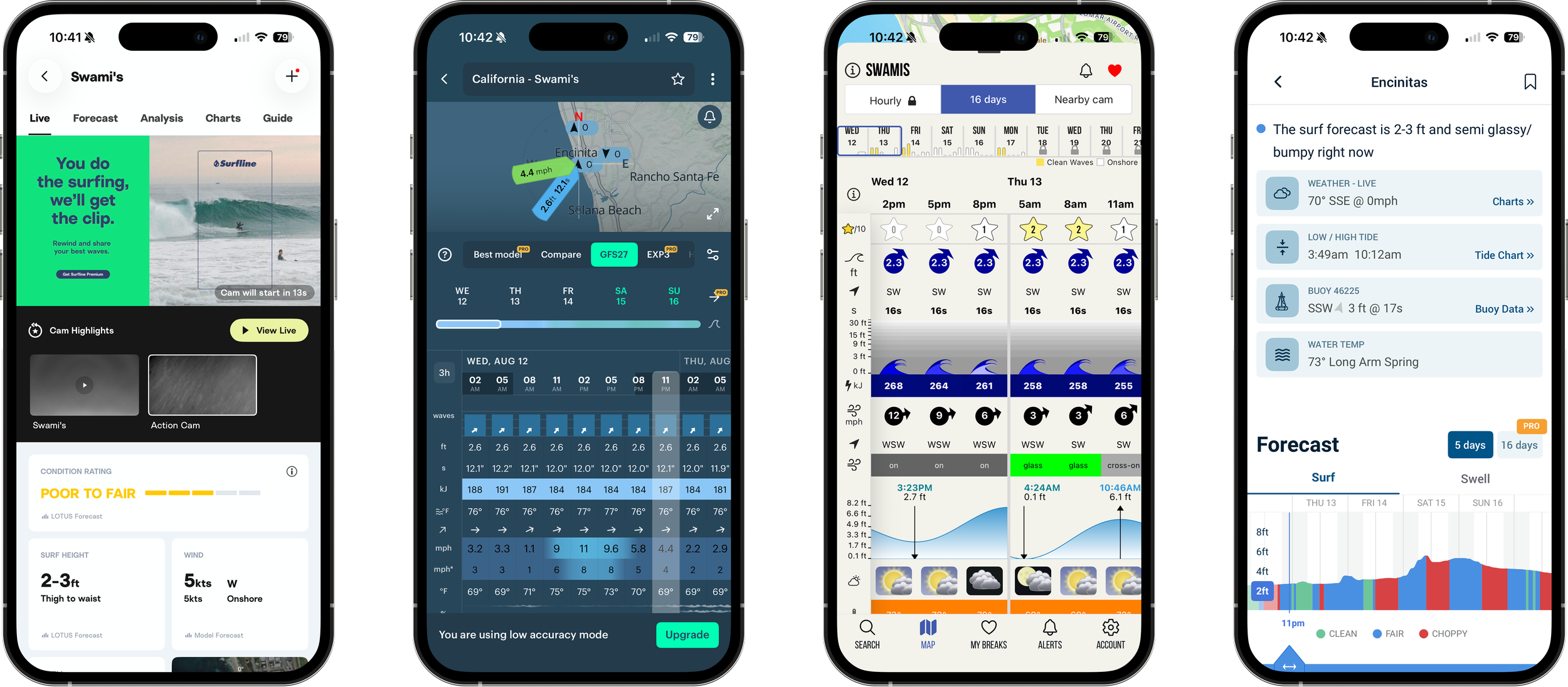
I spent a lot of time investigating other apps: Surfline, Surf Forecast, Surf Captain, and Windy. After auditing each site, I learned which elements were most common –– and what Foamo’s users would likely expect from us:
Maps: View surf breaks & forecasts directly on a map
Breaks: View all forecasted breaks in one spot
Favorites: A place to save your favorite spots and quickly access them
Mission Statement / About: A chance to build trust with the community you want to serve (i.e. Why did you build this site? How did you build this site?)
I also spent time on community research; I read what people were saying in online forums and chatted with folks out in the world too.
I learned what people liked:
Live cams
Digestible forecasting
Good visuals
Sense of community (community photos, waves of the day, & forums)
And disliked:
Expensive paywalls
Forecasts with learning curves
Dated web design
If we could create a modern, community-centered, and user friendly app, Foamo might just be able to step into that empty space.
Visual Design
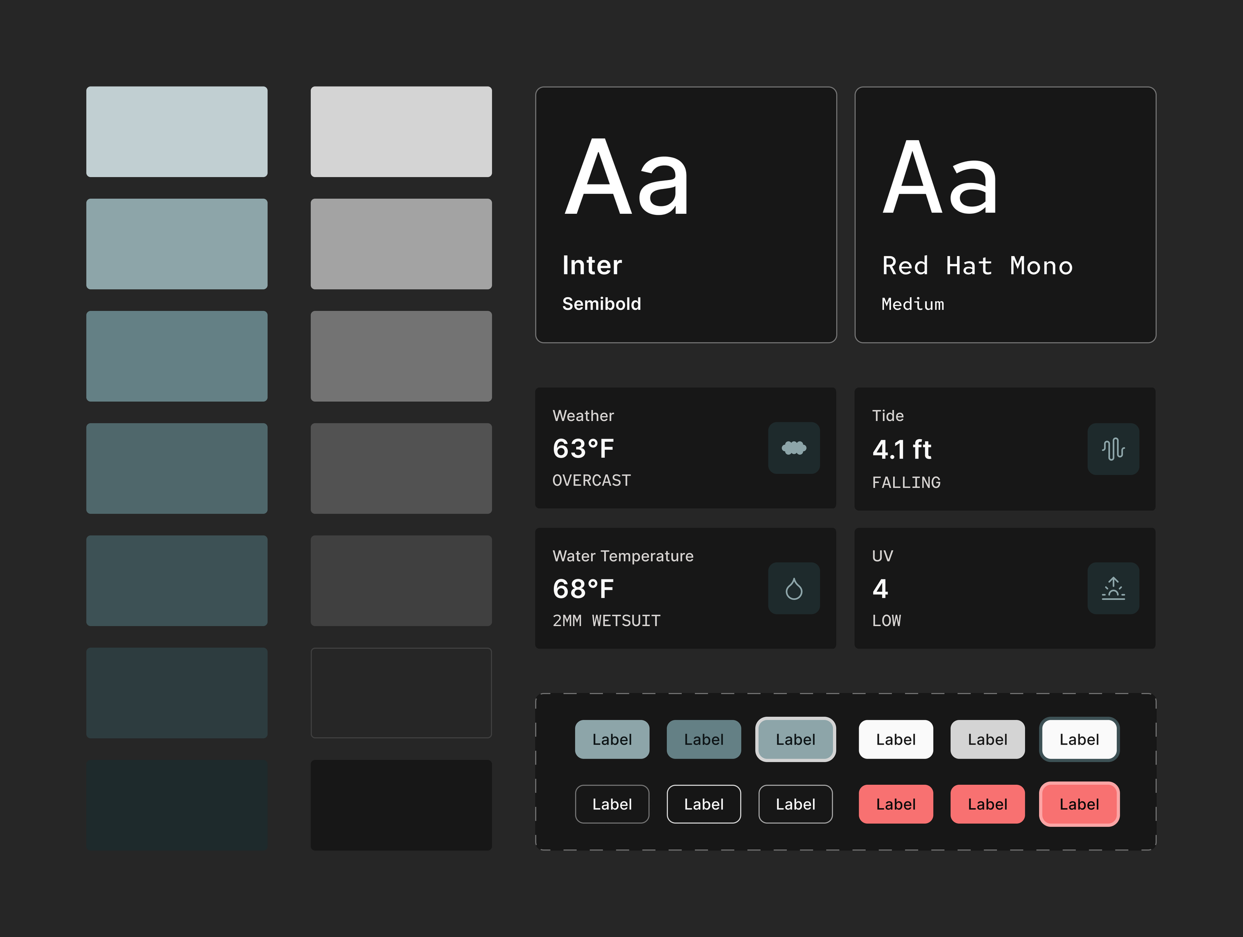
Nearly every surf forecasting app uses a medium blue for their primary brand color and/or light mode for their sites. We were inclined to follow suit at first, because ocean blue and clean lines do indeed feel like the perfect match to surf forecasting.
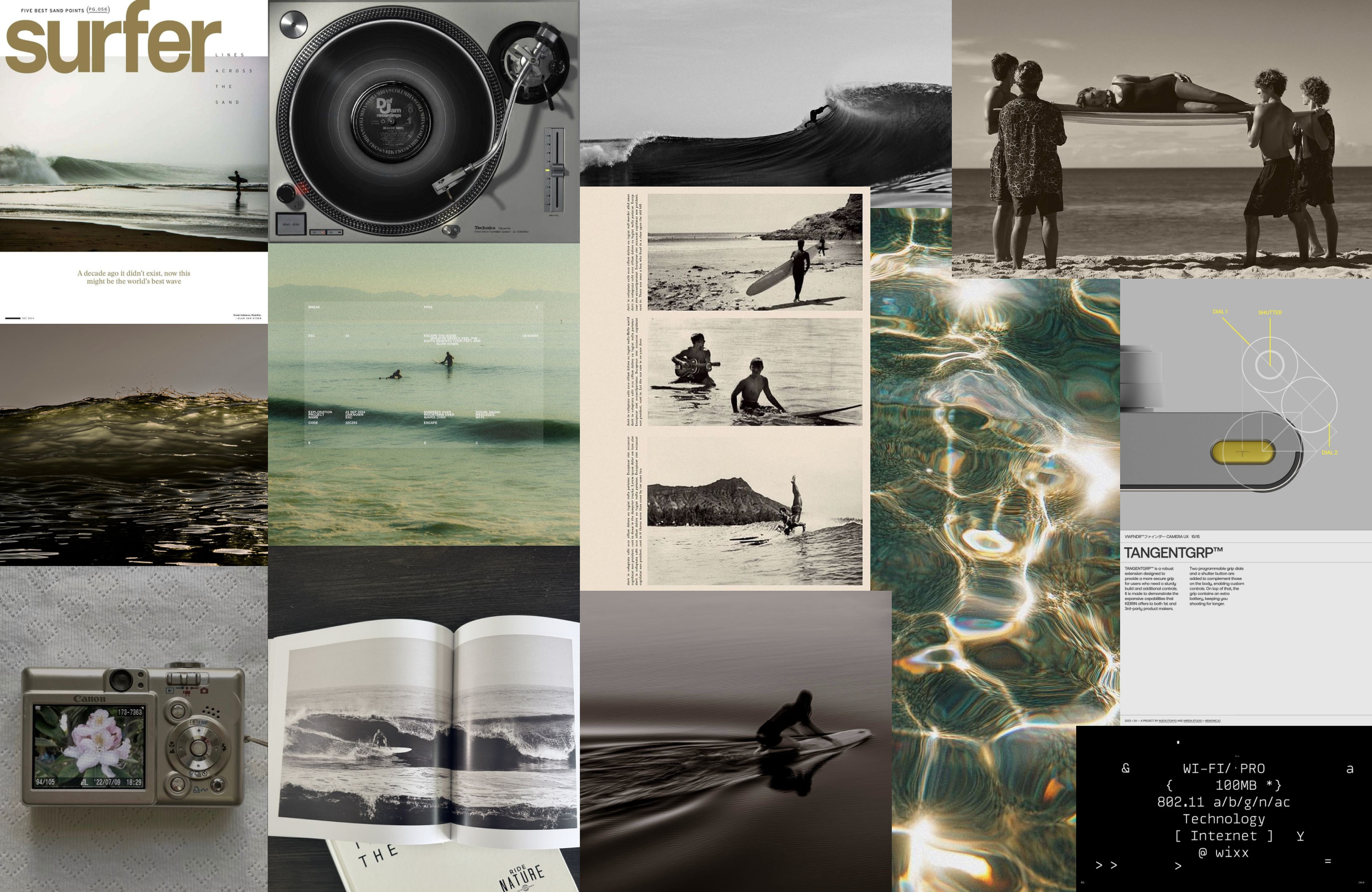
However, if Foamo was going to operate a little differently, it should feel different. We wanted Foamo to feel like early mornings, hot coffee, and saltwater. Dark mode may also feel better on bleary eyes at dawn.
I created a couple mood boards to explore different directions; the one pictured above is the one we ultimately chose to guide our branding. We used shadcn for our design system for a beautiful, consistent, and efficient implementation process.
Meet the MVP
✦
Meet the MVP ✦
Surf’s Up!
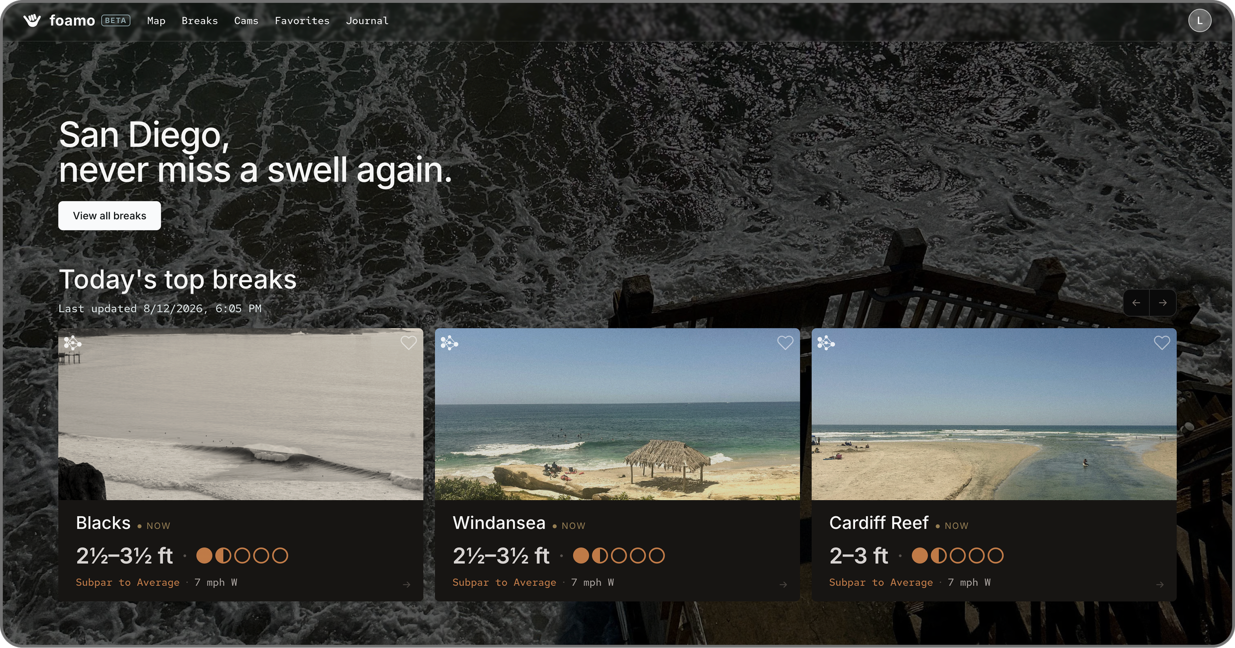
Welcome to Foamo! The landing page features the top breaks of the day, calculated by Foamo’s very own SLAM model which “is tuned to the physics, bathymetry, and local knowledge that makes each break unique.”
Competitive Research & Jakob’s Law
Elements we knew to include, because most users spend time on other surf forecasting sites that all had these pages in common.
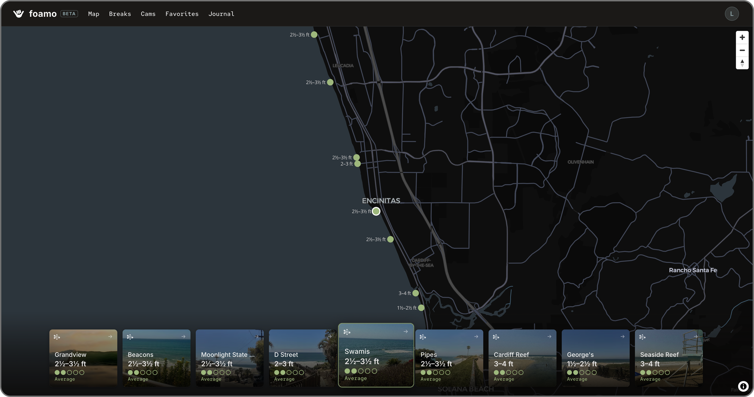
Maps
Find your break’s forecast by locating it on a map. Each break is pinned with the color it is currently rated at. The Maps view makes it easy to find your break if you remember its whereabouts but perhaps are blanking on the name.
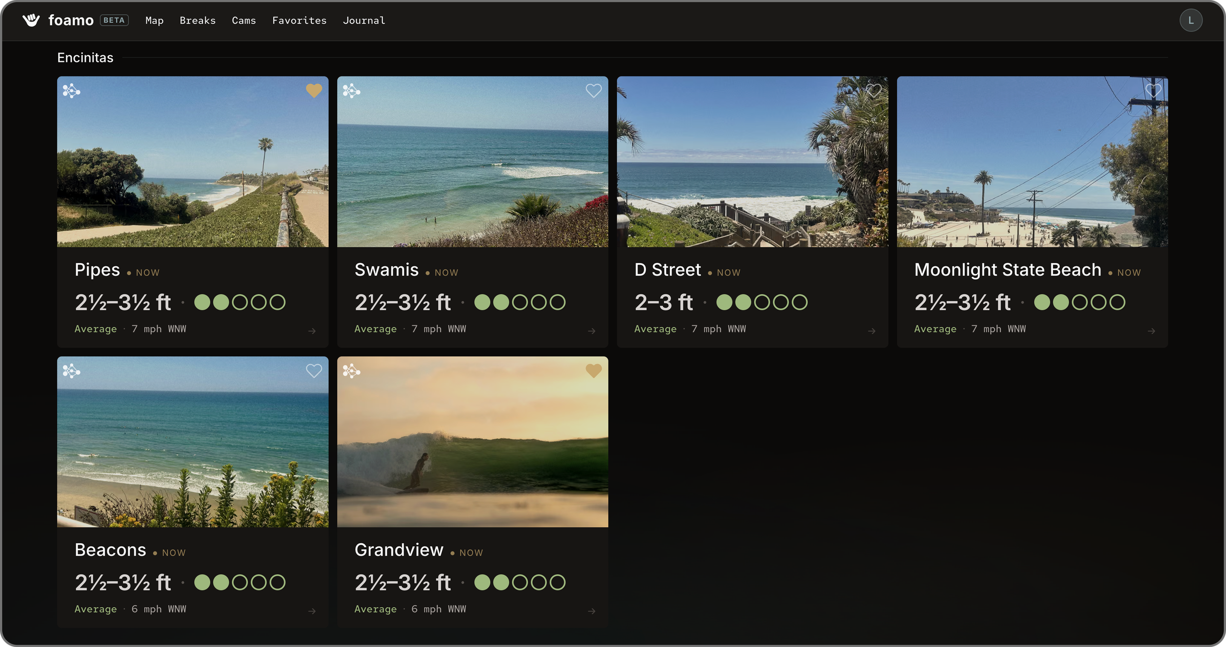
Breaks
Alternatively, find your break in a card display. Let the break names or photos jog your memory of a great session or entice you to try somewhere new!
People have the choice to sort the breaks by region or by what spot is best rated at the moment.
Favorites
Tap the heart to favorite a break, making it easy to keep all your favorite or home breaks in one spot.
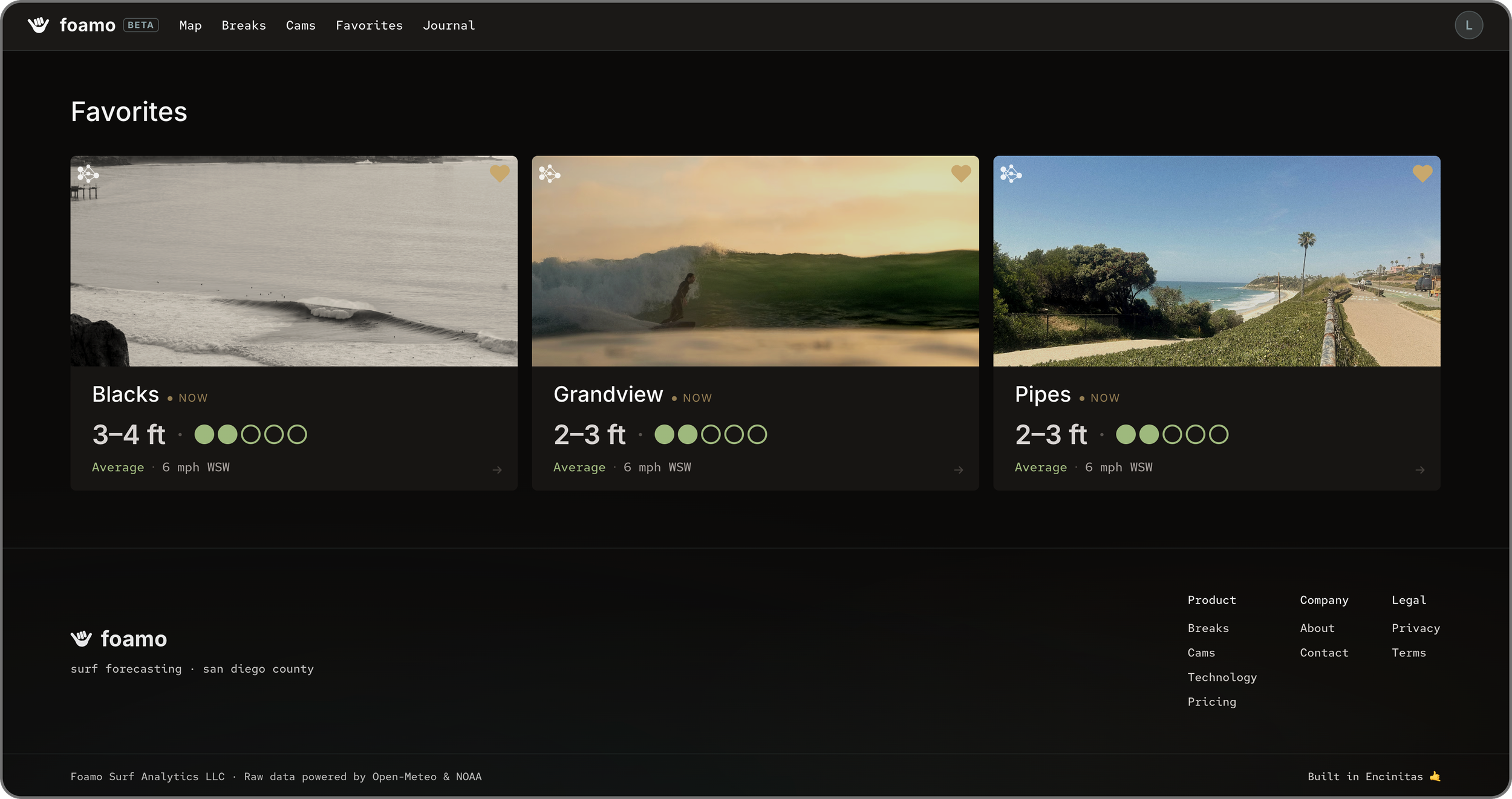
Community Learnings
From community research, we learned to prioritize visual design, digestible components, and the community itself.
Thoughtful Ratings
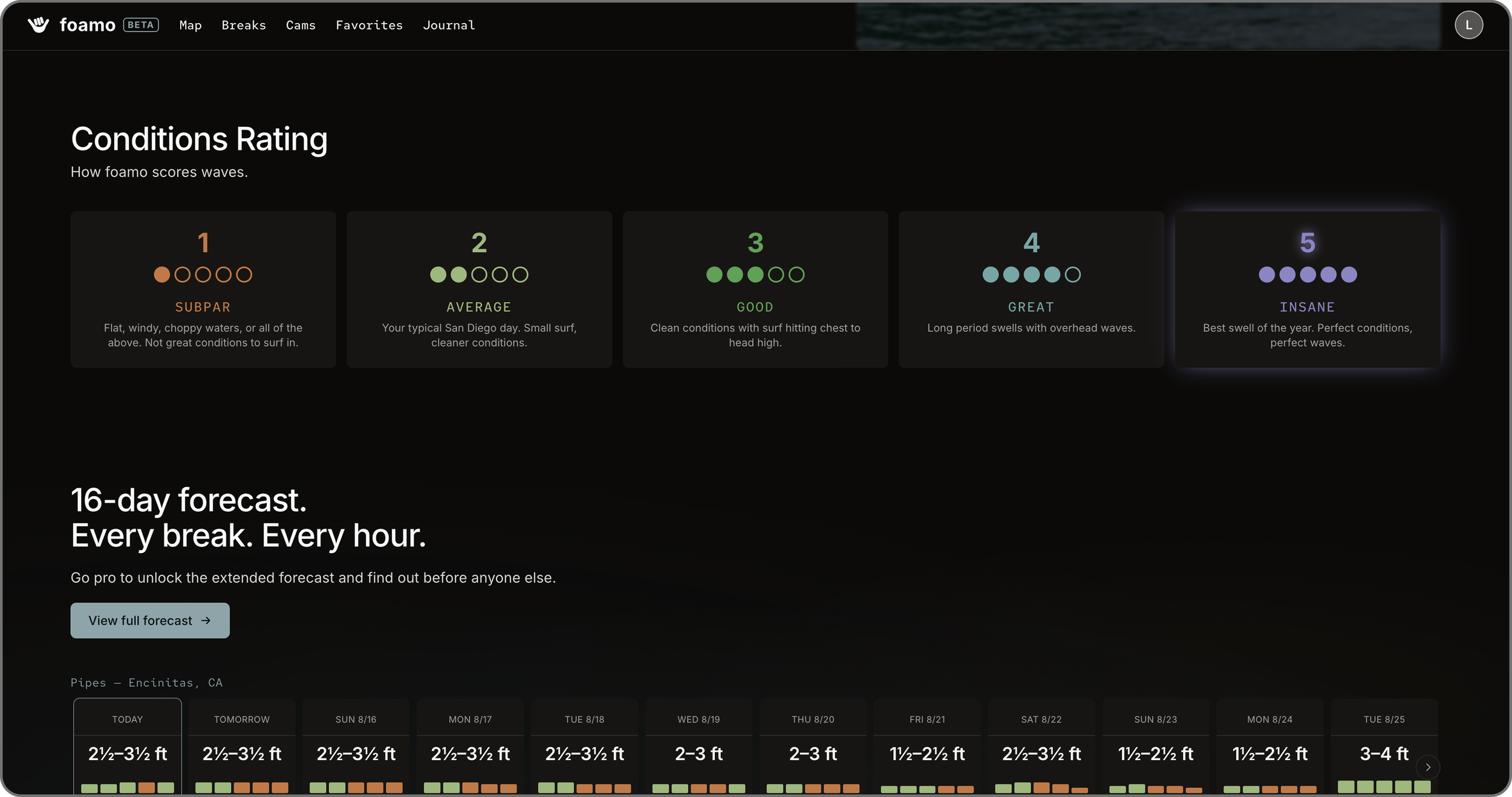
Foamo’s visual language was very important to us and didn’t always come easy. Among the challenges was the rating system (from 1 to 5). My natural inclination to adopt a classic red, orange, yellow, green, and more green wouldn’t quite work.
The average day in San Diego scores a 2-2.5 rating on Foamo’s scale, and most folks we talked to would typically go out on a 2-2.5 rating. Assigning an orange or yellow shade did not align with that.
To reflect how ratings related to our users’ decisions, we adjusted our color scale accordingly!
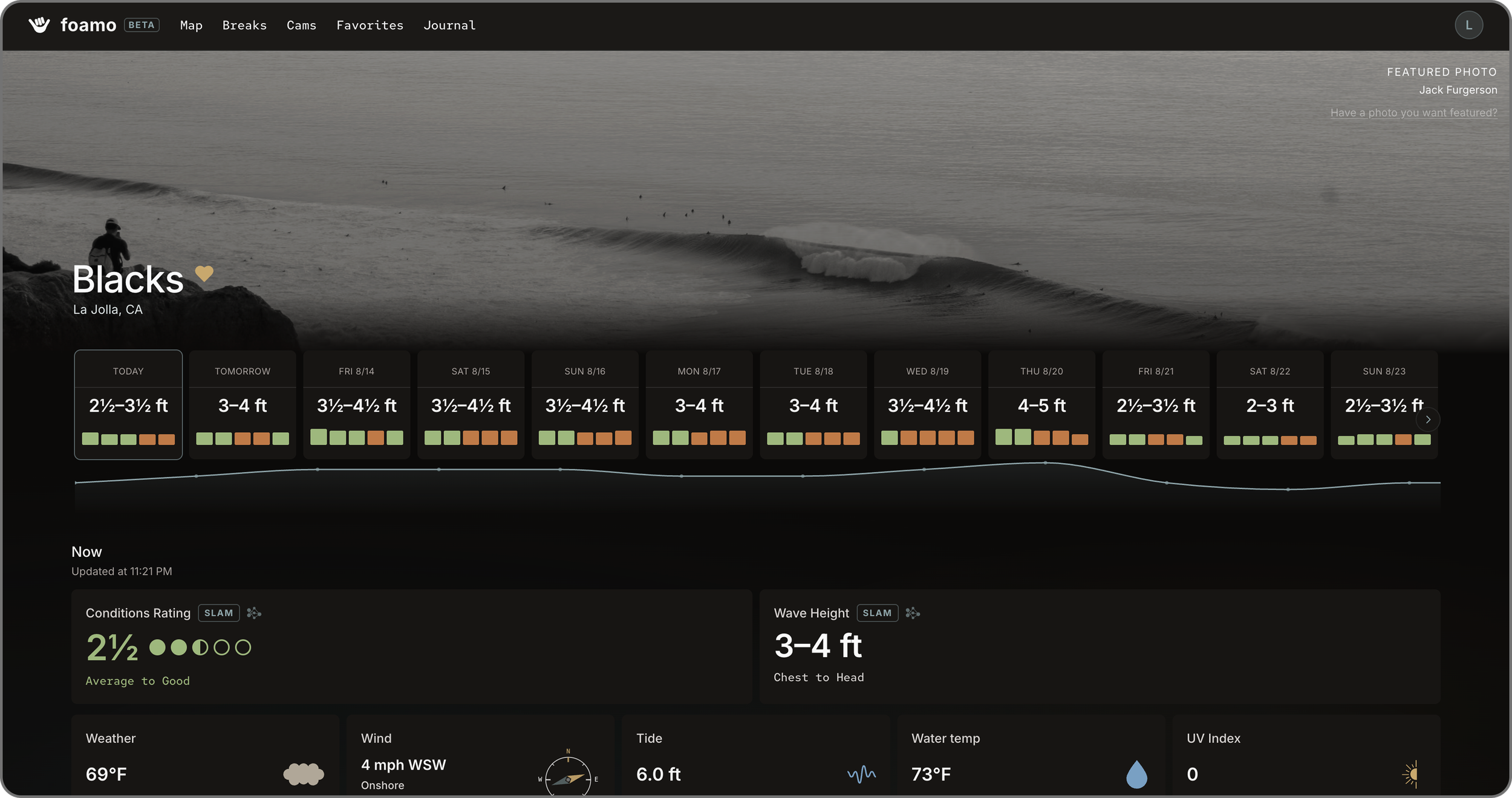
Surfers can submit photos for the chance to be featured as that spot’s cover photo. This is just one small step (of hopefully many) in the direction of a more community-focused app.
While I advocated for a community forum, we were not quite ready for the overhead needed to moderate an online community (but perhaps that can come soon).
Featured photo by Jack Furgerson.
Community Foundations
Something New
Can Foamo live up to its name?
Log Your Sessions
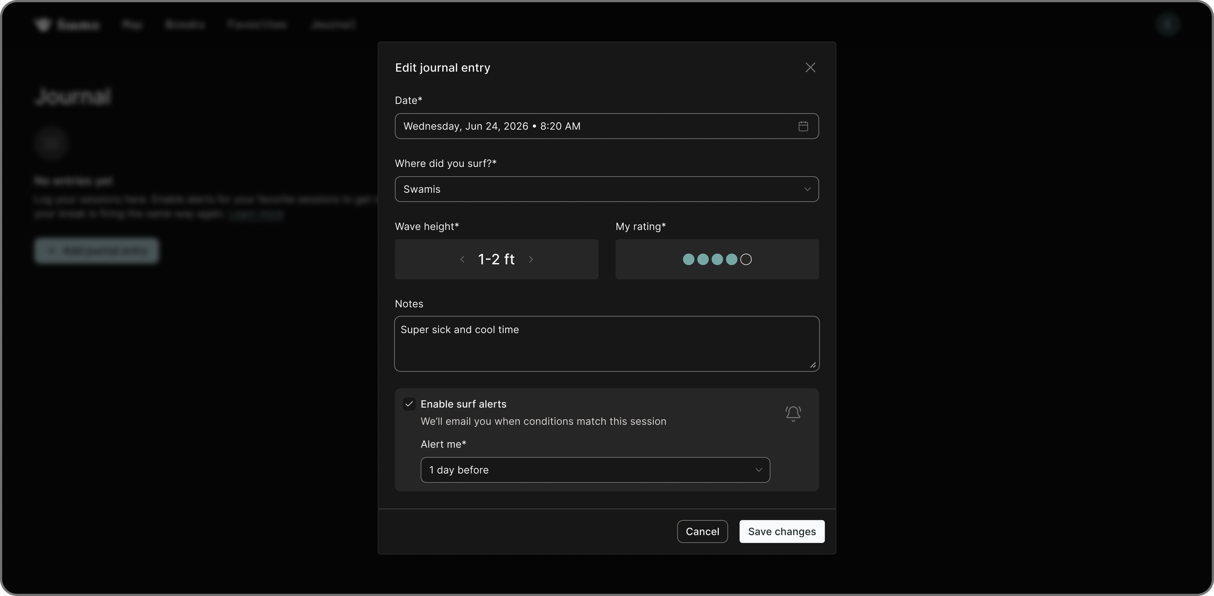
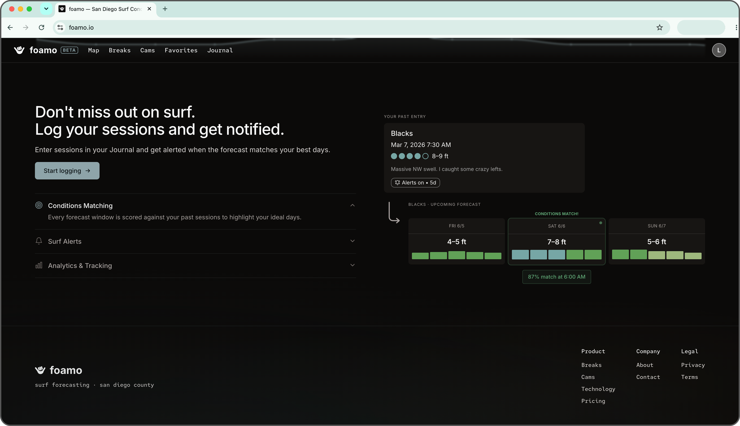
People can log their sessions in Foamo after they surf!
Journals helps you keep track of your memories and can be an encouraging tool for beginner surfers to look back at their progress.
If you loved your session, you can set up a surf alert! Foamo will look at the conditions of your session and ping you every time your break is firing the same way again.
No FOMO, Just Foamo
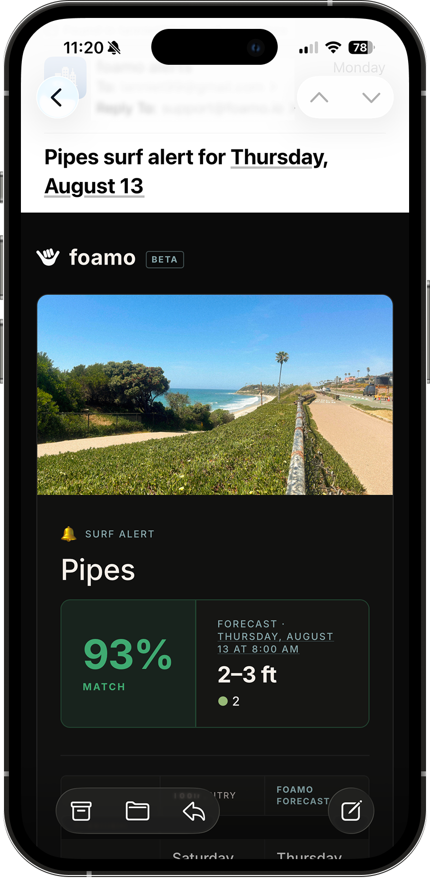
When the conditions match your surf alert, Foamo sends a notification straight to your inbox!
Foamo can send alerts up to 7 days in advance to the condition match to help you plan your week. We bring the forecast to you, when it’s relevant to you –– minimizing your screen time and maximizing your good times on the water.
Foamo is available now!
★
Never miss a swell again
★
Foamo is available now! ★ Never miss a swell again ★
You can check it out here: foamo.io
A million thanks to Hunter, the founder of Foamo, for including me on this wonderful project, offering brilliant design feedback, and knowing lots more about what surfers want than I do (I’m bad at surfing).
See you out there!
Available Now
Check
it out!